
When we sat down and reviewed real, live moving-company sites for this piece, we did not go looking for the neglected ones. Several were the opposite, run by operators who clearly take the web seriously: current photography, genuine reviews, years of visible investment. That is why the pattern that follows is worth writing down, not filing away as one company’s oversight. It shows up on well-regarded, well-invested sites about as often as it shows up on tired ones. Almost nobody goes looking for it, and the people who built these pages were each optimizing for something reasonable that had nothing to do with the one thing the page is for. That pattern has a name: website conversion leaks. Aggregators charge for exactly this kind of unforced error, multiplied across an entire market.
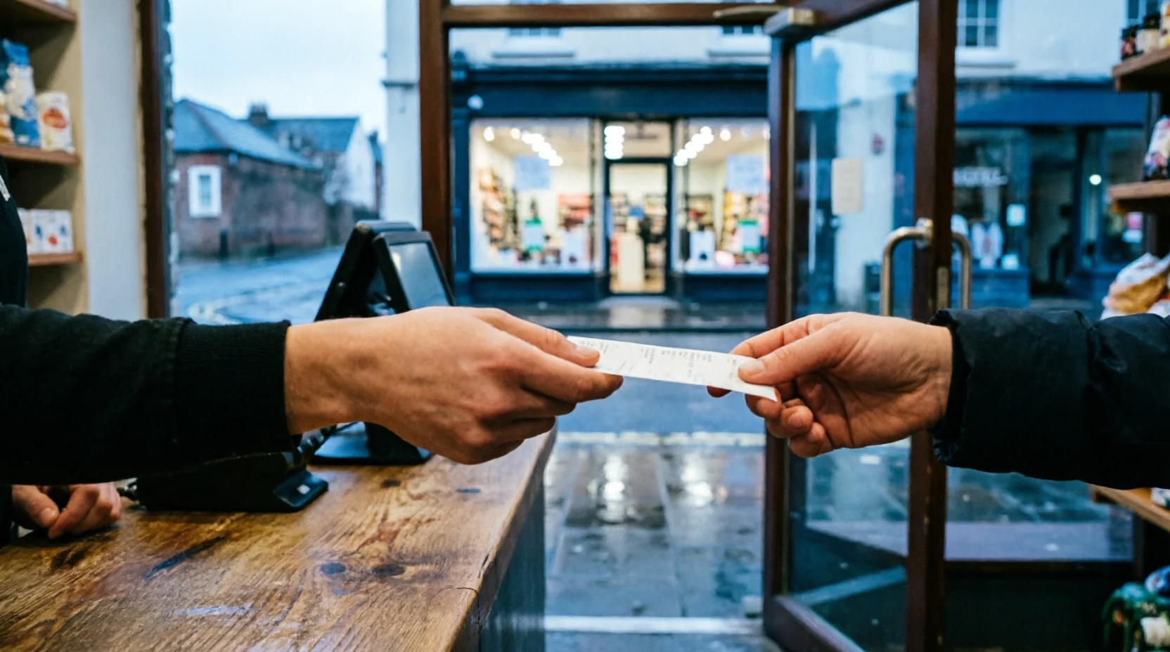
A shop assistant greets every customer personally and answers every question. Then, the moment the customer reaches for their wallet, the assistant hands them a flyer for the store across the street. That assistant would not last the week. Most operators’ websites do a version of that more than once before a visitor ever reaches the quote form, and the operator paying to bring that visitor through the door has usually never noticed.
That is the real question underneath this piece: is your own website quietly sending the customers you already paid to reach somewhere else? Not through a defect a stranger built into it. Through choices that felt reasonable, even generous, at the moment someone made them.
The trade the aggregator is making
This site has already described twice what that trade costs when a marketplace makes it on purpose. The six-quote problem walks through what happens once an operator’s quote enters a platform’s blind auction: real qualification time spent, and a result with no reason attached. Every transaction also teaches the platform something it sells back to the next operator at a slightly higher price. The distribution tax puts a number on the other half of the same arrangement: the dollar cost, compounding over time, of renting demand from someone else’s gate instead of owning the road to your own door.
Both pieces describe a transaction. A platform takes a visitor who already decided to act, and in exchange for access to that visitor, it charges the operator, learns from the exchange, and keeps the relationship for itself. It is not a friendly arrangement, but it is at least an honest one. The platform is charging for something real, and everyone involved knows roughly what the price is.
Almost nobody has priced the version of that exact trade an operator’s own website runs on itself, for nothing.
Is your own website quietly sending customers somewhere else?
Ask most operators why their header carries three social icons, why the “read our reviews” link goes straight to an outside platform mid-quote, or why the navigation bar lists fourteen items. The honest answer is some version of: social links and a reviews page build trust, and a full menu means we’re not hiding anything. Every one of those instincts is reasonable on its own. Put together on the one page whose entire job is to keep a paid-for visitor there long enough to convert, they add up to a site handing its own traffic back to the open web, one click at a time, at the exact moment a visitor is deciding whether to stay.
Three specific exits turned up on page after page during this review, on sites that otherwise looked considered and current.
The header that offers six ways off itself before the pitch loads
Three, four, sometimes five icons sat across the top of the pages reviewed for this piece, each one a live link to Facebook, Instagram, YouTube, or LinkedIn. Each was weighted on the page exactly as heavily as the phone number and the quote button beside them. Every icon is a door. Click one and the visitor leaves the site, built and paid for to sell them a move. The visitor lands somewhere an algorithm decides what they see next, with no guarantee any of it points back.
A real, if narrower, body of research explains why crowding a decision point with more options costs something. Sheena Iyengar and Mark Lepper’s famous jam study deserves precision, because it gets misquoted constantly: shoppers offered a table of 6 jams bought at roughly ten times the rate of shoppers offered a table of 24. The study happened, and it found that. It does not prove that fewer options always convert better everywhere, and a decade of follow-up work has made that clear. Benjamin Scheibehenne and colleagues’ 2010 meta-analysis pooled 63 conditions and more than five thousand participants and found the average effect hovering near zero. Its confidence interval straddled no effect at all. A direct attempt to rerun the original jam experiment in an upscale German supermarket found nothing. Choice overload is real under some conditions and absent under others, and nobody has fully mapped which is which.
The header icons undermine something narrower and older than choice overload: attention on a single, distinctive next step. Hedwig von Restorff’s 1933 finding, still holding up in modern review, was about memory rather than clicks: an item that stands alone against a field of similar items gets noticed and recalled far better than one lost in a row of equals. A quote button surrounded by four social icons of matching size and color is not isolated. It is one option among five, on a page where only one of the five was ever supposed to matter.
The review link that hands the visitor back to the marketplace
The second exit is more specific, and more expensive. A “read more reviews” link sits right where a visitor is comparing this operator against two or three others, and it goes straight to that operator’s public profile on an outside review platform. That page is one the operator does not control. It surfaces the map, the competitors nearby, and often a panel of similar businesses, pointing at exactly the names the visitor was trying to choose between. The operator built a page to make its own case. The reviews link, at the precise moment of comparison, walks the visitor over to the one page on the internet built to show them everyone else’s case too.
A popular claim in UX writing holds that Amazon deliberately strips navigation out of its own checkout flow for exactly this reason, to remove every possible exit at the moment of decision. That claim deserves honesty: it does not trace to anything Amazon has published, patented, or said on the record. It is widely observed and repeated in UX circles, though Amazon has never stated it as deliberate policy, and it should carry no more weight in this argument than that.
What Amazon has actually said, on the record, carries the real weight here. An Amazon director who helped shape the product strategy behind Alexa and Amazon Music, Kintan Brahmbhatt, named the exact mechanism directly: “Context switching often happens when a customer must navigate away from your app or site to complete a task. It’s the point at which your customer will abandon your product.” That is not folklore. A named Amazon leader describes, in a credible operator publication, precisely what an off-site reviews link does mid-quote.
The mechanism has support outside Amazon too. Diana DeStefano and Jo-Anne LeFevre’s review of hypertext reading found that every link a reader encounters mid-task is a small decision of its own, weighing whether to follow it, and that decision load measurably drags on completion of the task the reader came to finish. A reviews link is not neutral information sitting quietly on the page. It is a decision the visitor has to make, at the worst possible moment to be handed one.
The natural objection is fair: don’t reviews build trust, and doesn’t hiding them look worse than showing them? The objection conflates two different things. Showing proof is not the problem. Sending someone away to go find it is. The star rating, the review count, three or four specific quotes with names attached, can all sit directly on the page, in the operator’s own layout. That does the identical trust-building work, without opening a door out of the funnel to do it. It’s the same principle a badge wall gets backwards: specific and attributed beats generic and borrowed, whether the proof is a review or a badge.
The menu built for the org chart, not the visitor
The third exit sits in plain sight on almost every page reviewed: a navigation bar carrying somewhere between ten and twenty items, organized the way the company organizes itself rather than the way a visitor thinks about their own move. Residential moving, commercial moving, storage, packing services, international, careers, blog, about us, FAQ, financing: each one is a tab, and each one competes for the same strip of space a visitor scans in the first few seconds on the page.
Baymard Institute’s research on product-catalog navigation, based on testing across 344 sites, found that 75 percent of them overcategorized their navigation in ways that measurably cost them customers. The reasons come down to two: visitors could not compare things across categories, or they wrongly concluded something was not offered at all because the category they expected did not contain it. A visitor scans a mover’s menu for a way to get a quote, past eleven other tabs, and runs the identical risk: wrongly concluding that the thing they came for is buried somewhere they have not found yet, and leaving rather than continuing to hunt.
It would be convenient to say the fix is a hard item limit, but Nielsen Norman Group’s own research explicitly rejects that. Kathryn Whitenton’s analysis of navigation menus found no support for a fixed rule like seven items or fewer. The real defect is not the count. It is whose logic built the list. A menu organized around what a business does internally (departments, history, press mentions) asks a visitor to translate their own task into the company’s language before they can act on it. A menu organized around what a visitor came to do puts the one thing that matters, requesting a quote, first and unmissable, and lets everything else recede.
What the echo costs
Every instinct behind these three choices sounds like good practice. Show your social proof. Be transparent. Do not hide your menu. Flip each one and the logic breaks down fast: a shop’s whole strategy is not usually to advertise the exits on the way to the register. The platforms this industry complains about the loudest spend enormous effort removing exactly this kind of friction from their own funnels, then build a business selling operators access to the visitors who stayed. An operator’s own website can copy the aggregator’s everything-available instinct. But it skips the part where the aggregator gets paid for the traffic it captures. That is not more honest. It is the same funnel, running at a loss.
None of this is a story about any one team being careless. It is structural, in the way an industry-wide pattern usually is: a handful of web-design agencies, review-widget plugins, and template libraries serve most of this industry, and a defect built into a template propagates to every business that licenses it, regardless of how much it cares. A well-run operator and an average one can end up with the identical header, the identical review widget, the identical menu logic, because neither one built the page from first principles. Every site carrying that template carries the same exposure, and no amount of individual diligence downstream fixes an assumption baked in upstream.
Why does a page built by people who genuinely care still leak visitors this way? The honest answer has little to do with competence, and everything to do with incentives. The agency that built the header gets judged on whether the client likes how the page looks, not on quote-form completions six months later. The review platform wants its badge clicked, because that click is how it proves its own value to the operator paying for it. Nobody in that chain was ever paid to protect the fifteen seconds between a visitor landing on the page and deciding whether to stay. The page ends up optimized for everyone’s goals except its own.
Borrow the model the distribution tax already built to put a number under this. A 100-move operator doing $500,000 a year and spending 10 percent of it on acquisition is paying $50,000 a year for a pipeline of visitors who are genuinely in the market to compare a move. That $50,000 buys attention. It does not, on its own, buy a conversion; the page still has to close what the marketing bought. Picture that budget landing a thousand qualified visitors a month, in round numbers. Walk a modest share of them through the three exits above: one in fifteen follows a header icon and does not return within the session, one in twenty clicks the reviews link into the marketplace’s own comparison page mid-decision, one in twenty-five gives up hunting through a menu that never gets them to a form at all. None of those figures is a verified industry statistic. Nobody has run a controlled study of this exact funnel on this exact industry’s sites, because until now nobody had reason to. But even a conservative version of that stack quietly voids a real slice of a $50,000 media budget before the page has done the one thing it was bought to do. The real number for your own site isn’t a guess. It’s sitting in the same two numbers that tell you whether a website is working at all.
The six-quote problem describes what a marketplace charges an operator for doing this on purpose, at scale, as a business model: taking a visitor who was ready to act and handing them somewhere else to go instead. A website that opens several of its own doors mid-decision is running the identical playbook against its own paid-for traffic, for free, with nobody on the other end even learning anything from it. The marketplace at least turns the transaction into data it can sell back to the next operator. A homepage that leaks the same way just loses the visitor and calls it normal.
The walk-through that costs nothing to run
The fix for all three exits needs no developer, no redesign, and no marketing budget. It needs someone at the business to do what a stranger comparing several movers under stress does: land on the homepage cold and click everything on it that is not the quote button.
Count the icons in the header first. If clicking one takes a visitor off the site with no path back into the quote flow, that icon is costing more than it proves. A social presence is worth having. It is not worth advertising at the same visual weight as the one action the page exists to produce. Most operators find they can drop two or three icons entirely and keep exactly the same social presence, just without a header full of live exits.
Follow the reviews link next, from a fresh, incognito tab, the way a visitor would mid-comparison. If it lands anywhere that also shows competitors, the fix is not to remove the proof. It is to bring the proof home: pull three or four specific, attributed reviews, quotes with names attached rather than a star average, directly onto the page, and let the outside platform stay a citation rather than a destination.
Then walk the navigation bar and ask, honestly, whether each item answers a question a visitor actually has, or a question the business wanted to answer about itself. Careers, press mentions, and company history are legitimate pages. They are not homepage-navigation-tier pages, competing for space with the one link that turns a visitor into a lead.
None of that fixes what an aggregator charges for access to a customer who was already looking to book. It fixes something cheaper and entirely within an operator’s own control: the version of that exact tax the business has been charging itself, for free, every time a visitor who was already there decided to leave.
Run the count for real. Open your own homepage in a fresh tab right now and click every link on it that leads off your own site during an active task, the way a visitor mid-decision would. However many you find, ask which ones were put there on purpose, and which ones just accumulated. That answer, not a redesign budget, is where this gets fixed.
A shop assistant who did that would get corrected by lunchtime, because someone would be standing there to see it happen. Nobody stands at a website’s shoulder watching every exit a visitor takes. That is exactly why it survives, on good sites and average ones alike, until an operator finally goes and looks. Website conversion leaks. Aggregators never have to go looking; they built a business on the fact that most operators don’t.
Movaros exists for operators who would rather fix a leak like this once than keep auditing it by hand: run your brand on shared infrastructure built to keep a visitor once they have already decided to stay.


